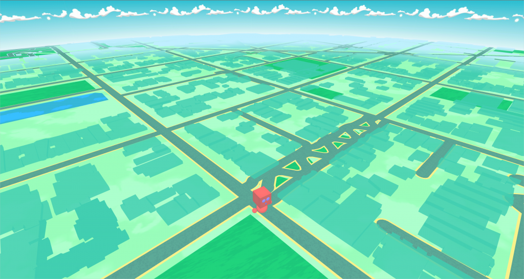
This theme settings are meant to be the fastest possible with GO Map – 3D Map for AR Gaming.
In my opinion this map is also the more “playable” of all the demo scenes for it’s neutral graphic style that leaves space to your game contents. The color palette is very greeny but every other base color would work fine.
Buildings: 3D, extruded to a fixed height of 2 units. Flat enough to see very far away without occlusions without losing the 3D effect. A transparent shader is added to the buildings material.
Landuse: All green (with texture). In this theme every kind of landuse is rendered in green like it’s a park.
Water: All blue (with texture).
Roads: Same textures and outline for each kind of road (even paths) with different line width.
Clouds: A rotating dome of clouds is placed around the Avatar to make a nice motion effect.
Fog: Blue colored fog from 450 to 600.
This map is way different from (almost) every other attempt to make a location based map in Unity 3D. Most of the times I’ve seen 3D buildings on top of a big texture image for each map tile. GO Map world is rendered by using only Unity meshes increasing a lot the overall graphic impression compared to raster tiles. That feels like a videogame, rasters don’t.
*Tip: checking the “Add GO Feature Component” on the GOMap inspector will add a GOFeatureMonoBehaviour component to every map object. That’s really useful if you want to raycast on touch or below the user to know on which kind of map he’s on.